BA1B00-Forest Fire (Red)
BABABA-Plein De Vie (Light Grey)
BA520C-Great Depths (Burnt Orange)
This palette is in line with the Master Design Blog Post because it provides a light, medium, and dark color. The range of the three choice is wide enough to show dimension and diversity. Also by picking only three colors it will be easy to keep the same theme for my web page. The color palette is a warm palette, which is inviting and friendly.
Sunday, March 21, 2010
Friday, March 5, 2010
Movie Poster

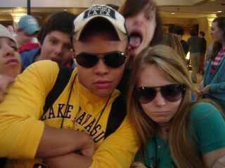
I choose to make a poster for my High Point University promotional piece. I used a paper filter to give it a vintage look and documentary feel. The photo is from last spring when i visited High Point. I picked the font for its fun, laid back feel. The drop shadow gives the type depth and adds definition to the tittle. I added the "movie type" at the bottom to give the whole piece a more authentic feel.
Subscribe to:
Posts (Atom)